When I met with Ryan and showed him my current art progress he told me that the pose below was a little off, that the back knee maybe needed to come up higher, that it could do with being more exaggerated. The whole pose could do with some exaggeration, even though it may look unnatural when you think about it, it would stand out a lot more and be a stronger pose. Small movements that seem deliberate can also convey more personality.
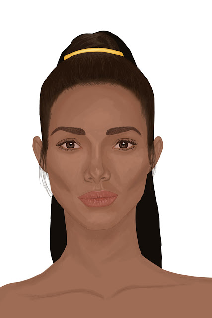
When looking at the portraits, he pointed out that they were flat, the light source was very front on and it could be improved with a little directional light and shading. The second was a version he did quickly to illustrate what he meant by using highlights and shadows to create more depth. I realised that it made a huge difference and I lack the confidence when it comes to bolder shading. I started off the portraits by painting a middle tone base layer, then adding shadows and finally highlights before blending all the tones together to create a smoother look. I was unhappy with how it looked, so blended further, however at the time I did not fully realise how flat I made it look.
Below is a WIP that shows the kind of technique I use. I tried to take what I learnt from watching Artgerm's videos, by going in with shade and building up the highlights, however this portrait just ended up strange looking by the end.Below is another process shot of before I blended and corrected the colours. You can sort of see the difference between the light and dark shades, however, it is minimal.
Below is when I went in to fix the eyebrows, blend, smooth and add texture detail to the skin. I used a speckle brush of some sort in a light colour, however ended up lowering the opacity so that it was barely visible... Now looking back at it it was quite pointless as it doesn't serve any useful purpose due to how little it shows.
Below I gathered two images to help me understand how light falls on the face and will try to keep it in mind when doing my characters!
Edited version second image, top one is the original.
Above is even more shading added, however her left cheek looks odd so I did some adjusting below. I am happier with the way it looks.
Below is the original on the left and the edited on the right. I think it could use more highlights.


No comments:
Post a Comment