I started this character different to the capoeira one. I thought I would try to design a suitable face before I continued to flesh out the character, as I feel that an issue that kept coming up with my capoeira character was her face; people were saying she did not look like a fighter, she looked too pretty. Whilst that is what I wanted for her, I want to make sure I get this character right, that he looks more worn and wise.
Below I used Ken Watanabe for reference, as I felt that he was a good base for my character, for example, he is Japanese and is around the right age for my character, with some wrinkles and serious eyes, in my opinion. However, I did not like my drawing, so did not take them further.


I used the man below as reference for the next few, and I was much happier with the way the sketches looked, however I still felt something was off. I tried to add some minor wrinkles around the eyes, and make the eyes smaller as well, but it was still not working. I tried to change up the hairstyles, but the problem w as with the face.


Below I based the sketches on a Japanese model, Daisuke Ueda, particularly because I liked his bone structure. There is also something interesting about the way he looks, whilst he is Japanese, he does not look overly Japanese, if that makes sense. He reminded me somewhat of Joseph Gordon-Levitt and Keanu Reeves. I thought I could try to make my sketch look more older, bigger, masculine, but eventually thought it was not the right look to pursue anyway.


After some research into Japanese culture, I came across Oni masks, and had an interesting idea. I thought it may be more intriguing to have my character wear an Oni mask, or even a Hyottoko mask. The purpose for giving him a mask is to obscure his personality/ alignment. I thought I could even draw it cracked so the viewer can see parts of his face, such as an eye and part of a mouth, and see a contrasting expression. Many big characters in games are either very friendly looking or mean looking, and I thought it may be interesting to draw a character who is a bit of both. One who, on the surface, you cannot easily read. So I started with these sketches below, and will try to find my way from here.

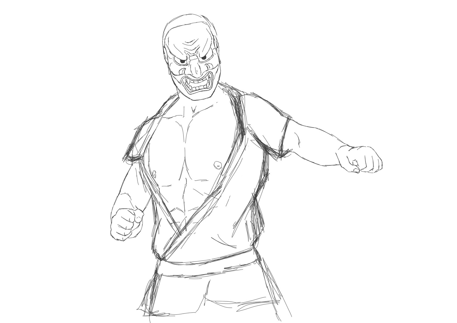
Below is a moodboard of images I created to inspire the above character. It has ideas on poses, clothing and masks, providing a starting point for exploration.

Below, I tested an idea of contrasting a somewhat evil mask with a pleasant expression, however, I feel that this combination looks a bit silly.

I adjusted the colours a little, really quickly just to indicate more shadow, it looks more how it should, however still very rough. Ultimately I do not like this idea.


I was going for this look below, with the twist of the contrasting personalities created by the mask and the human himself. However, I need to rethink the mask design and placement on the face so it looks better.

Below I did another test using the above image as reference, but trying to communicate a amiable expression on the face. I feel like it sort of worked, however it looks a little too devilish and does not have the same impact as the image above when you cannot clearly see the eyes.


So below I did a sketch of two masks forming one whole. Initially I did not like this at all, but looking at it again after some time, it looks alright. However I am still not entirely satisfied with it. Perhaps it is the mix of the masks, as in the two masks I am mixing. Perhaps two different ones will work better together. It is very similar to the Yin and Yang concept, I admit, however the reason why it appeals to me is the enigmatic quality it can have on the character. It reminds me also of Vega from Street Fighter, how he wears a mask, however he removes it after fights; the reason being that he does not what to ruin or damage his face. Ultimately I want my character to embody confusion and mystery about who they are to their opponents. A similar character, previously mentioned is Takuma Sakazaki (Mr. Karate) who wears the Tengu mask to hide his identity.


I then stumbled upon a blog post (http://returnofthemex.blogspot.co.uk/2015_09_01_archive.html) that talks about Akuma's (Street Fighter) design and how it was inspired by Nio (https://en.wikipedia.org/wiki/Nio), which are "two wrath-filled and muscular guardians of the Buddha, and you can find statues of them guarding temples.

I find the idea of them interesting as they are noted to be wrath-filled, yet they are protector gods of Buddha and Buddhism, which to me seems like a big contrast. Also the two represent life and death, the one with the open mouth, the Agyo represents violence and life, and the one with the closed mouth, the Ungyo, represents strength and death. This again links to the Yin and Yang concept, but also fits with the idea of a mask as well as having ancient Japanese roots. The depictions of these Nio are fearsome, how I want my character to appear, indicated by his size.
I also came across the god of war, Hachiman. Representations of him look sophisticated and peaceful compared to other gods of war. The thing that stuck out most to me about the image below is the ring framing his head, I'm guessing it's equivalent to a halo but unsure.

I also looked into Yoshimitsu's design and there was one that I liked a lot that also featured that similar halo style ring:
I would like to incorporate the ring or halo along with an Ungyo mask. The reason for this is because Judo is considered a pure sport, and the character could be representing Buddhism by wearing the mask.
In another blog post similar to the previous one (http://returnofthemex.blogspot.co.uk/2015/07/how-fight-culture-became-fighting-game_15.html) there is mention of how the poses themselves of the characters Akuma and Mr. Karate were inspired by the Nio. It goes to show that using mythology and ancient history you can rework a character or figure and create something more modern, whilst retaining some elements yet producing something new looking.
In that same blog post another character is talked about, Lee Pai Long, who wears a mask that is painted to look like Sun Wukong, the monkey god. What strikes me about this design is the colours, the yellow accentuates his clothing and ties in nicely with the mask. The green adds more interest and dimension to the mask, instead of having it as just gold and red. It shows how simple use of colour can go very far, and again, create a new version of something that already exists.

Below is a drawing inspired by the idea of a Nio mask and the two contrasting expressions. I am not sure that it works too well because the mouth area seems disjointed and does not fit smoothly together.

Here I tried to draw on one expression. i think it works, but my drawing looks less like a mask and more as if that is just his expression. I also feel that it gives off a very stern vibe and do not like the idea of just one expression. The one on the right is slightly wider.


I tried out a design where the eyes were cut out of the mask, so you can see them clearly. I quite like this as it looks cooler and more original in terms of design, because it is not just a full mask. You can also still make out the expression to a certain extent because the eyes are clearly visible.

Below is an attempt to draw the two Nio as one mask, but it is very very difficult to make it look decent. I do not think it will work unless there is a clear split between the two sides.


Here the eye areas are completely cut out to allow a clearer view of the eyes. I am not entirely sure of this design yet as I feel it would work better with more contrast between the two sides, however I do like that they look like different designs on both sides.

I remembered that one member of the band Hollywood Undead, Da Kurlzz, has a mask based on the idea of a split personality, as can be seen below. These three are the ones that interest me the most, whilst they are simple, they are easily read. You can see the difference in the two sides by the eyebrows, eyes and mouth, so these are definitely the areas I should focus on. However, I am striving to make this mask look at one whilst representing two different emotions, which I am finding somewhat difficult.


No comments:
Post a Comment